


Today was a difficult day for me. I initially thought I would be continue my focus on media queries after fixing my issue from yesterday. I had no idea I would be spending most of my time I usually dedicate to coding on trying to correct my header/navbar's responsiveness issue.
The issue I was having was when the browser screen width passed about 1000px or smaller, my navigation bar links would automatically align vertically like list elements which was also causing an issue when trying to use media queries. I did figure it was the width of the parent container but when I increased the width to accommodate the shrinking layout the same issue was still occurring.
I decided to redo the entire navbar and after rewriting the html part about 10 or more times I as able to find a solution that works best for me. Instead of un-orderly list and list elements I decided to use my favorite element, div.
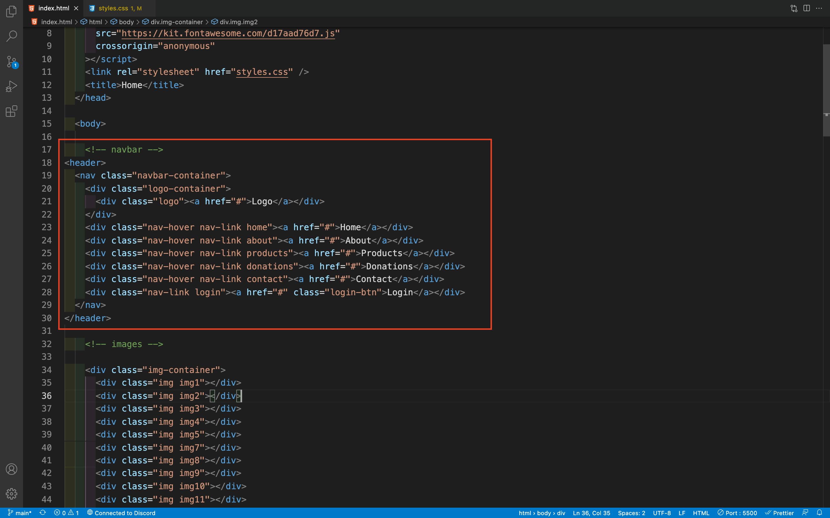
Before attempting to create my navbar using divs I was naturally curious of whether creating navbars this way was an accepted practice by senior devs and the public. From my understanding from all the debates and articles I came across on google, there is no good reason as to why using divs in your navbar is a bad idea. So this is how I will being doing my navbars for now on until someone can validate a reason not to.
After setting up my HTML, styling with CSS flexbox was straight forward. I am finally satisfied on how my site looks and react on desktop shrinking windows. This project has been a really great learning experience for me so far. And now that I have gotten all my errors and bugs squared away. I will probably redo my media queries to accommodate my new navbar
It doesn’t look like I changed much but the code behind it is much more responsive

Stay Tuned...